

habit
Apple Health's latest feature designed to create positive cycles, boost routines, and empower users.
Product Type
Add a Feature
UX Researcher
UX / UI Designer
Role
Industry
Technology
4 Weeks
Duration
Background
Apple Health is making mental health a priority! With the introduction of State of Mind, Apple hopes to enable users to stay mindful of their mental well-being by offering tools to track emotions, assess depression, and manage anxiety.
the problem
Acknowledging users' current mental states represents the initial stage in addressing mental health issues. However, it is equally imperative to identify seemingly insignificant factors that significantly impact their daily routines, thereby fostering a positive cycle and instilling feelings of empowerment, motivation, and validation.
Consideration& COnstraints
Our data may be limited as we need to be sensitive when talking about mental health conditions, and participants may feel uncomfortable talking about their potential experiences.
Users who wish to use a habit-tracking app may be uncertain about what habits they want to form.
Finding the balance between incentivizing and disincentivizing can be difficult as mental illnesses arise from various factors.

research
Research goals
I aim to figure out what motivates users to form habits, especially young people or those dealing with mental health issues. This will help encourage them to use the app regularly and develop positive habits. To do so, I hope to:
Find out what drives users to form habits.
Learn how users with mental health issues feel - what encourages or discourages them.
Understand the different priorities users have when forming habits.
Identify the needs and challenges users face when using habit-tracking apps.
Understand what other elements (ex. design, sub-feature, etc) the users look for or would like to have in the feature.
user testing
I conducted user interviews with five participants between the ages of 20 to 39 with diverse levels of tech literacy.
For more insight into the user interview, visit the Affinity Map.
Key Findings
40%
stated that having rewards is deterring, while another 40% stated that having rewards is essential, and 20% indicated that it depends on the type of reward.
60%
stated that having a community will not be helpful due to several factors, including privacy concerns, the level of sustainability in the long term, and their unfamiliarity with communities in general.
80%
said they want notifications/reminders when creating habits & identified simple and easy navigation as a deciding factor for choosing a habit-tracking app.
competitive analysis
I conducted competitive analysis of apps that have same or similar features and or purpose for habit tracking features.

Competitor 1: Habitica
Habitica is a habit-building and productivity app that motivates users to grow and maintain their habits by gamifying the process.
Feature:
Through creating avatars and gamifying the process, Habitica allows users to build habits and manage tasks by leveraging game features to motivate users.
Encourage users to engage in app parties and other social features.

Competitor 2: daylio
Daylio is a mood-tracking and journaling app designed to help users track their emotions, activities and routines.
Feature:
Through journals that do not have word count limitations, the app allows users to keep track of their moods and habits.
Includes a mood tracker that allows users to track not only physical but also emotional aspects of their health.

Competitor 3: Samsung Health
Samsung Health is a pre-installed app with various features for tracking fitness, monitoring nutrition, managing stress, and gaining relevant health insights.
Feature:
Includes stress management features such as, guided breathing exercises, mindfulness activities, and stress tracking.
Users can set health goals and participate in challenges within the app to stay motivated and engaged.

define
user persona
Based on the user interviews and competitive analysis, I created two user personas with differing needs and frustrations: Healthy Fitness Student and No Time for Workout Professional.

how might we…
To understand how to create a habit-tracking feature that could facilitate both types of users, I created How Might We questions:
How might we create a seamless experience for users to be able to easily track and develop their physical and mental well-being?
2. How might we assist users in identifying the habits that are most suitable for their needs and preferences?
3. How might we encourage users to develop new habits and remain engaged for long-term development?

design
user flow
I wanted to ensure that the user flow reflected the brand’s existing flows to ensure an aligned and concise user experience. I tried to create two user flows that best reflected the identified users’ needs for simple but supportive features:
Add a new habit
Track a habit
flow 1. add a new habit
Scenario: Samantha is a busy student and a fitness model who is an active user of fitness and health apps to track her nutrition and workouts. She is looking for an app that can not only allow her to track her exercise and diet but also allow her to develop positive habits to improve her physical and mental health.
flow 2. track a habit
Scenario: Samantha has wanted to develop a habit of drinking 2L of water through out the day, so she has added a new habit to her Apple Health app.
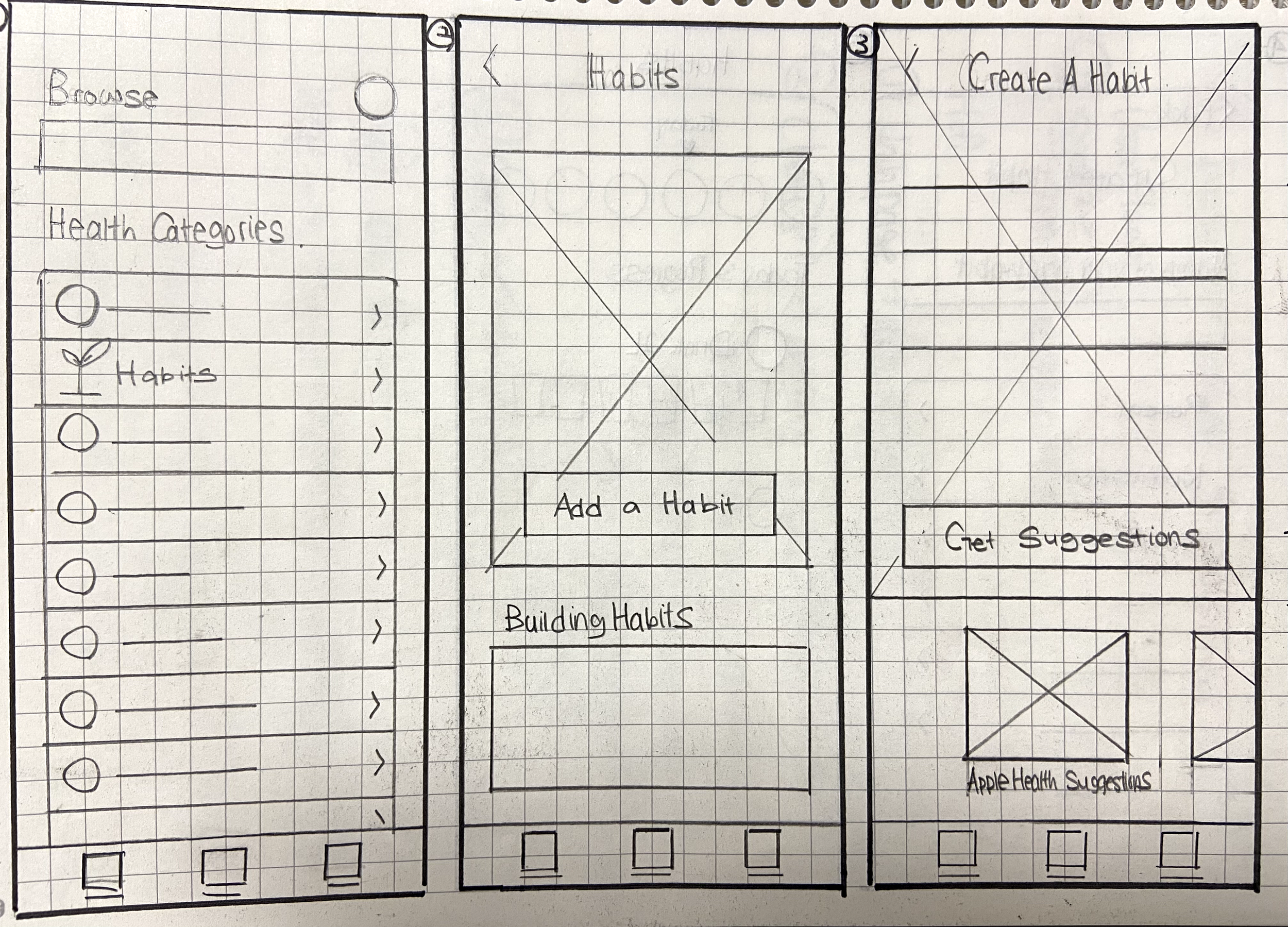
Low-Fidelity wirframes
With the identified user expectations, I tried to create essential features and interactions in sequence with the existing brand structures and components.

logo
I identified three core values for the Habit feature: hope, support, and growth. These values reminded me of sunflowers, representing positivity, strength, warmth, and lasting happiness—the message I aim to convey to users. To emphasize these values, I incorporated yellow-orange tones into the logo design.


test
high-fidelity user testing
I conducted high-fidelity usability testing with five participants with different levels of experience with third-party habit-tracking apps and Apple Health. To determine whether the users can easily add and create their own habit flows and find/browse existing habits lists without any significant issues, I tested the following task flows:
Create a new habit track
Mark a daily task/habit as complete
key findings
100%
rated ‘Create a new habit track’ as 5 on a scale of 1 to 5 (1 - difficult / 5 - challenging)
60%
stated that the flow is simple and straightforward.
40%
stated that they are unsure of the purpose of the snooze button and the difference between snooze and skip.
For more information on the usability testing results, visit the Excel Sheet.
iterations
[1] ‘Repeat’ feature was removed from the notification settings screen
While conducting the usability test, a number of users were confused about the purpose of a repeat button. Based on the judgement that a repeat feature will not be necessary as there already are the ‘skip’ and ‘remind me later’ features for reminders, the repeat feature was removed to enhance clarity for user experience.
Before


After
[2] Logged Section has been added
When asked to mark a habit as complete from the Main page, a few users faced delays due to uncertainties about where to click. In order to serve as a guide to the users’ eyes, the ‘Logged’ section has been included to hint to the users where to look when trying to mark habits not yet marked as complete.

Before

After
[3] order of cta buttons on task completion screen has been modified
First, to minimize confusion between skip and snooze, snooze has been replaced by skip so users can request another reminder after a few minutes. Then, ‘remind me later’ feature has been added for users to indicate no need for future reminders.

Before

After
habit
Introducing new apple health feature!

conclusion
key takeaways
Navigating User Needs: Integrating a new feature into an established brand posed the challenge of balancing user preferences with existing brand identity. While users desired a livelier interface with illustrations and vibrant colours, Apple's design ethos prioritizes simplicity and cleanliness. To meet user expectations without compromising brand integrity, I creatively incorporated elements like the Sunflower feature logo and Habit Completion Pop-Up Message screen within permissible areas, ensuring a harmonious blend of user-centric design and brand consistency.
view more case studies
Mobile First Responsive Web Design
Jackie Jewelry
freshly
End-to-End MVP Mobile App