
Freshly

Introducing FRESHLY, your ultimate meal-planning sidekick! Say goodbye to food waste and kitchen chaos with our intuitive mobile app.
Product Type
End-to-End MVP Mobile App
Product Designer
UX Researcher
UX / UI Designer
Role
4-5 Weeks
Duration
Health
Environment
Tech
Industry
background
In our world, where hunger affects over 800 million people, a third of all food produced is wasted, contributing to half of food system greenhouse gas emissions. Despite young adults’ growing interest in reducing food waste,barriers such as limited cooking skills or financial constraints hinder efforts to reduce household waste.
The Problem
There are various existing meal-planning apps that help to serve users' various fitness and health needs. While they serve essential functions for these young, diverse users, they do not clearly identify and address the reasons behind increased food waste seen amongst young users.
Why is identifying causes of increased food waste amongst young adults important?
Those between the ages of 18 to 34 have been found to generate nearly 50% more avoidable food waste than those over ages 65 and over.
Addressing core reasons for increased food waste amongst individuals in the age group is one of the most effective ways to reduce individual household food waste.
“Imagine if there was a convenient mobile app that not only provided tasty recipes but also helped users plan weekly meals, making use of leftovers and available ingredients to enjoy delicious meals while minimizing waste.”
Need to keep in mind that increased household food waste can arise from multiple different factors including user’s social standing, economic constraints, time inflexibility, dietary needs/preferences, and lack of culinary understanding.
Collaboration with third parties including other apps and markets in order to create a smoother flow for users needs to come later.
Considerations & constraints

user research
Research Goals
Our mission is to create an app to help users cut food waste by finding recipes from fridge ingredients. By doing so, we aim to foster a cycle of waste reduction for economic savings and environmental benefits. To reach this goal, aim is to:
Understand users' reasons for food waste.
Identify challenges in managing leftovers.
Analyze user behaviour in sustainability-focused apps.
Explore expectations for recipe-finding apps addressing food waste.
User Interview
To understand potential users' needs, wants, and pain points, I conducted five hybrid-format user interviews with those aged 20 to 36. The participants were either individuals just freshly starting to live by themselves or individuals at important times in their careers living with a partner or a roomate.
For a deeper understanding of the user interviews, go to the Affinity map.
Key Findings
80%
of the users’ challenges with meal planning were affected by social factors including age and occupations playing one of the biggest roles.
80%
acknoweldged and admitted that they tend to produce more household food waste than absolutely necessary.
100%
stated that they would be open to using meal planning apps if it helps them to reduce household food waste and relieve meal planning stress.
Competitive Analysis

Competitor 1: Plan to Eat
Plan to Eat is a mobile app that allows users to store their recipes and generate a shopping list for the week, enhancing their enjoyment of cooking.
Features :
Users can import recipes from the third party, which the app will structure according to its style once imported.
Allows users to plan leftovers for later meals.

Competitor 2: Intent
AI-powered meal planning app that allows users to flexibly plan their meals based on their dietary needs and preferences
Features :
Offers AI-generated meal schedules based on users’ preferences.
Allow users to filter based on the types of meals they want, such as cheap and/or fast meals.

Competitor 3: Kitche
App for food waste prevention that allows users to mentor their food inventory, plan meals, and receive notifications about expiration.
Features :
Includes unique features, including food inventory management and CO2 and water cost savings tracking.
Allow users to scan their receipts to review the products they want to import into their grocery list.
For a more detailed version of the competitive analysis to get a better understanding of each competitor’s strengths, weaknesses, and opportunities, go to the Affinity Map.

DEFINE
USER PERSONA
From user interviews, I crafted two personas representing key traits within our target audience: New Cook Explorers and Busy Professionals.
How Might We…
With the target audience more clearly identified, the next questions were around how to best align overall user experience design so that they address these needs, pain points and expectations:
How might we assist users in finding recipes based on their needs and preferences so that users can enjoy diverse dishes without having to search on multiple platforms?
How might we allow users to minimize food waste resulting from expired ingredients and leftovers?
How might we create a less stressful experience for users to create their meal plans and reduce food waste?
features
Must Have
Recipe Filter Options
Auto-Generated Shopping List
Photo-Capture Feature
Planning Leftover
Collaboration with Family and Friends
Nice to have
Built-In Timer
Simple but Lively Interface
Can come later
Voice-Recognition
Collaboration with Supermarkets and Stores


ideate solutions
Low-fidelity wireframes
Informed by user interviews and competitive analysis, along with sitemaps and user flows, I initiated wireframe development. Core values guiding this process include prioritizing diverse features for food waste reduction while ensuring a seamless, intuitive user experience without unnecessary delays.


Low-Fidelity Wireframe User Testing
I conducted low-fidelity wireframe user testing to gauge if the basic design meets user expectations and uncover any unaddressed needs.
Key Findings
80%
stated that they prefer the ‘one specific day’ option for the schedule overview screen.
60%
suggested that having a short guide or tutorial of all of the features could be helpful in navigating the app and enjoying all of the available features
40%
commented that allowing users to set serving sizes for each meal could be helpful in preparing a meal plan.

design
Freshly was named based on the core brand values which were clean, sustainable, sustainable, and transparent. For users to have to have a fresh new start every week with Freshly to not feel obligated but rather enjoy the meal planning process.
UI Kit & Branding
Typography

I have used a combination of Poppins and Inter typefaces. Poppins, with its playful yet modern and sophisticated style, very much reflects the brand's style. Inter, with its clean style, blends well with Poppins, while its clean and bold lines make the body text more accessible and responsive even on smaller screens.
Colour Palette

To align with Freshly's brand values and ensure user focus, I aimed for a clean and simple interface. Green, symbolizing freshness and vitality, was chosen as the primary color while utilizing a monochromatic palette maintains a minimal style while prioritizing accessibility.
Logo

As Freshly’s target audience are individuals in their 20s to 30s, I wanted to incorporate a fun and lively logo that is still simple and clean.

Final prototype
High-Fidelity User Testing
I conducted user testing with five participants from the target audience to assess the app's alignment with user expectations, needs, and pain points, and to validate its efficiency. The high-fidelity prototype user testing evaluated the user experience of the following flows:
Create a weekly meal plan.
Search for a recipe using the filter option.
Usability Testing REsults
100%
experienced no problem with the onboarding process.
80%
had one or less errors when going through the first flow of creating a new weekly meal plan.
100%
rated the experience of finding a recipe using the filter option as 5 on a scale of 1 to 5 (1- difficult / 5- easy).
iterations
Additional tool Tip Onboarding
Additional tool tips were included on three different sections of the prototype:
[1] Five Features on the Schedule Page

Tooltips for five features were included to enhance users’ understanding of the purposes of each feature.

A tooltip for the built-in timer was included to allow users to be aware of the timer without having to open a different app on their phones.
[2] Built-In Timer for the Recipe Instructions Page
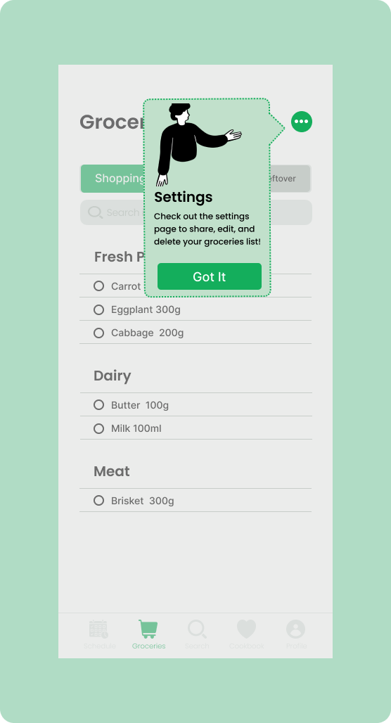
A tooltip for the settings tab on the Groceries page was included to allow users to be aware of the resources and features they could find using the tab.
[3] Settings for the Groceries Page
2. MOved the edit and delete features to the settings tab
Initially, there were pencil icons for editing and trash can icons for deleting beside each of the text input fields. However, based on the efforts to ensure the basic touch point area for accessibility and to ensure a clean and simple interface, the two features were moved to the settings tab. Simultaneously, users can also simply tap on the already inputted texts to edit.
Before
After


3. Included ‘Allergeis’ as one of the filter options
The allergy filter has been added as one of the options based on user testing and awareness that allergies are an important issue to address on apps relating to food.
Before
After


Say Hello to FRESHLY

KEY TAKEAWAYS
USER CENTRIC ATTITUDE: No design is ever perfect. I once again realized the importance of constantly asking for users’ feedback which can open doors to new possibilities and designs you may have never known.
LESS IS MORE: Minimal does not equate to minimum. I learned that to allow users to have a simple yet fulfilling experience, you must find the right balance between responding to users’ needs and expectations and not overdoing it.
Lessons Learned

Challenges
FINDING THE BALANCE: I believe user experience is about constantly trying to find a better balance, whether it be between business goals and user goals or between one solution or the other. As a designer, trying to understand what is would be a more suitable decision for the user based on user interviews and testings was definitely a delightful yet challenging experience.

view more case studies
Apple habit
Add a Feature
Jackie Jewelry
Mobile First Responsive Web Design